Embodying elegance in real estate and hospitality
Experts in retail real estate and hospitality, BOND RP is passionate about helping bring big ideas to life. They craft visionary concepts, build strategic relationships and execute tailored strategies for developments and hospitality brands. Above all, BOND RP fosters the development of communities that are vibrant, lasting, and prosperous for all.
As BOND RP partners with owners and leaders to develop premier properties and launch national hospitality brands, it’s key they have a brand presence that exudes professionalism and confidence. We came on board to craft their visual identity, web design and deck designs.
Balancing luxury and simplicity
For BOND RP’s visual identity, we played around to find a delicate balance between minimalism, sophistication and refinement. Inspired by high performance luxury brands, we wanted to embody the brand’s reputable professionalism and understated luxury to craft a powerful yet poised identity.
We opted for a pared-back colour palette consisting of two primary tones: Night, a deep sophisticated slate black, and Sand, a creamy off-white. These colours work in harmony– while Night conveys depth and authority, Sand brings warmth and approachability, balancing the brand’s sophisticated persona.
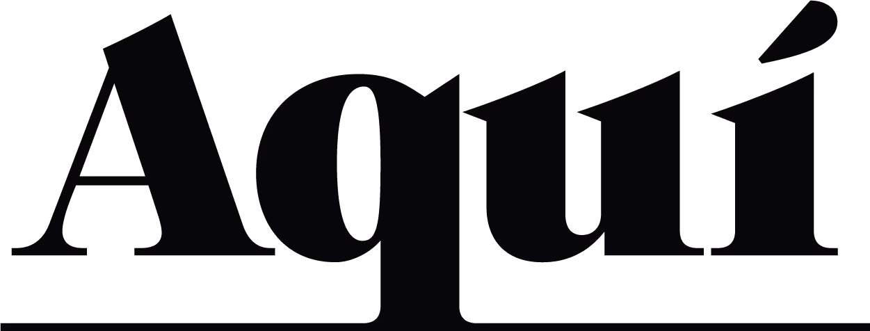
For the primary typeface, we opted for Dilemma Serif. The humanist font has a wide width giving it a striking bold appearance, but the thin strokes and subtle serif details bring out the elegance of the brand name, creating something confident while refined. When paired with Karla, a clean and simple sans-serif font, the logo commands authority and presence, delivering a look that exudes credibility and understated chic.

The power of refinement
Once we had crafted BOND RP’s visual identity, we applied it across two main brand touch points: web design and deck design.
Although the branding is streamlined and understated, we created movement throughout the website by strategically using white space, contrasting colour blocks, and subtle arrows and lines to highlight areas of interest. The chosen typography played a big part in styling the website, making sure the clean design allowed room for bigger expressions and exploration into founders’ innovative approach to retail real estate. The overall aesthetic is uncluttered, allowing the brand’s message to be communicated clearly and effectively.
BOND RP’s tagline is ‘Putting Relationships in Place’ and this sentiment is embodied in a pitch deck. We knew it was crucial to use the new visual identity strategically in this asset, as it forms the all-important first point of contact where BOND RP connects with a prospective new client or partner.
The modern new branding balances minimalism and luxury to position BOND RP as a leader in their field, appealing to a discerning audience that values quality and sophistication.