反思性实践,思维工作室
成立于 1996 年, MAPS 是一家全球设计事务所,由其负责人 Tan Hock Beng 和 Maria Hartati 领导。MAPS目前的项目横跨29个国家的约93个城市,因其能够为不同的文化背景创造变革性体验而赢得了国际声誉。该实践表明了对酒店项目的高度重视,与 Hyatt, Hilton, Six Sense, Marriott, Accor, Shangri-La, Leela, Pan Pacific, InterContinental, Oberoi 和 Padma 等顶级豪华酒店运营商合作。
没有地图的旅程
MAPS 这个名称源自校长兼创始人 Tan Hock Beng 的设计工作室 “Journeys without Maps” 在新加坡国立大学建筑学院,他在90年代初任教。Hock Beng 告诉我们,他经常 鼓励学生不看地图进行探索。 这不是要有一个固定的目的地。Der We gist das Ziel —— 旅程就是目的地。” 他相信设计过程就是探索 —— 常看常新。
而 Hock Beng 为 MAPS 所寻求的正是新鲜感。29年来,徽标商标支持了对代表性的适度需求。尽管Hock Beng一直很确定实践代表什么,但如何直观地将其呈现出来仍然是一个开放式的对话,Aquí很荣幸能参与其中。
一系列不断演变的旅程
正如 MAPS 的设计理念所阐述的那样:“By inclination, we firmly believe that creating architecture is like a series of wonderfully malleable journeys through different phases.”
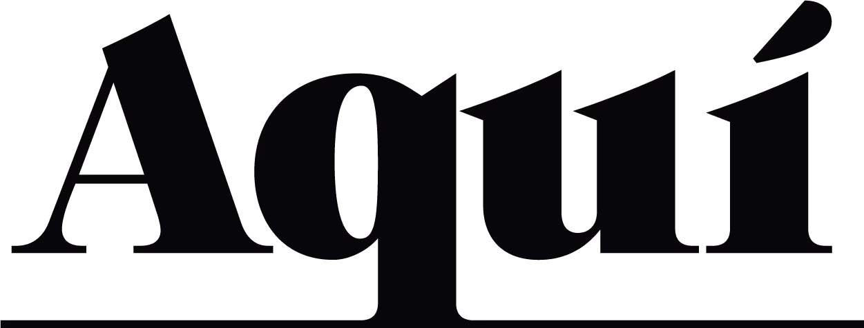
我们真正想捕捉的旅程的本质是结局和起点的模棱两可。这在视觉上体现为标志文字中刻意留白,象征着开放,暗示着漫无目的的探索的概念。每一笔定制的线条表明没有两种旅程是相同的,这反映了MAPS 在建筑中采用的个性化和量身定制的方法。为了纪念原始徽标的完整性,我们保留了其简洁性,并通过添加微妙的细节引入了一些奇迹。
凭借其手写特征和精致的轮廓,Gotu 字体适合于一个需要反映根植于传统的低调奢华的徽标,该徽标捕捉了 MAPS 今天继续建立的变革性和持久遗产。
MAPS 在与客户一起旅行中起着巨大的作用。它的色彩如同值得信赖的伙伴:既沉稳内敛又对比鲜明,既富有同理心又坚定有力。Deep Taupe 和 Ivory Mist 单独使用时低调内敛,搭配在一起却气势十足。Tide 和 Platinum,展现出沉着冷静与精准无误的气质。

一个活体设计展示
网站本身的设计就像一张地图。进入网站仿佛跨入了另一个世界,首先映入眼帘的是一段动画,它描绘了 Hock Beng 优雅的素描轮廓,随后轮廓逐渐成形。在短短几秒钟内揭晓,接下来是清晰的身份陈述和触觉视觉效果,以坚定而直接的方法确立存在感和个性。
短短几秒钟内,品牌形象便跃然纸上,随之而来的是清晰的身份声明和触感视觉效果,以坚定而直接的方式确立了品牌的存在感和个性。短短几秒钟内,品牌形象便跃然纸上,随之而来的是清晰的身份声明和触感视觉效果,以坚定而直接的方式确立了品牌的存在感和个性。
网页设计摆脱了传统的限制,尝试了比例和空间构成,以营造一个生动和谐的展示实践的作品。导航仍然故意保持简单——不是为了淡化身临其境的体验,而是鼓励在没有固定目的地的情况下进行探索。这些内容经过精心策划,可以有效地让访客清楚地了解对MAPS的期望。交互式元素(分区导航、项目清单和交互式地图)可以邀请和装备人们进行更深入的参与。